Warm But ‘Cool’ – An 04 Kitchen and Bath
March 4, 2017
by Bob Shamo –
Tom and his wife started looking at Park Tower condos three years ago. Already Chicago residents, they had long admired our modernistic building. But they wanted just the right unit, which for them would have one bedroom and an expansive view of Lake Michigan.
That right one turned out to be an 04 on an upper floor. As configured originally, 04 units had a walk-in closet positioned at the end of a short hallway — bedroom to the left, bathroom to the right.
How else, Tom wondered, might they use this small but valuable space? As a laundry room with stacked washer and dryer? As an office, perhaps with wall murals in lieu of the non-existent windows? Keep it as a closet, but wall in the hallway door and instead access it from the bedroom?
The couple considered all these options but decided on another: They doubled the size of the bathroom by removing the wall that separated it from the closet. More on that later.
Upon entering the unit, I was struck by its openness. “Yes,” Tom said, “We wanted to be able to entertain 10 or 15 people, and the way it was, there just wasn’t enough room.”
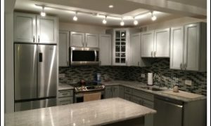
Other than a shallow ceiling soffit, nothing remains of the walls that originally formed its kitchen. That space is now a blend of white, off-whites, grays, an occasional black, and stainless steel.
Several items stand out. One is the island, larger than you might expect for a unit this size but fitting right in thanks to the lightly-patterned granite countertops and gray-shaded ceramic floor tiles. Another is the refrigerator, a stylish Haier model, of cabinet depth with squarish features, two freezer drawers, and more interior space than you’d think.
A third feature — my favorite — is the corner cabinet with clear glass panels. Tom is modest about this and other design elements, explaining, “My wife has excellent taste.”
Two flood lights recessed into the soffit provide unobtrusive island lighting, while simple L-shaped track lighting casts subtle shadows and adds depth to the wall cabinets. Undercab lights are on Tom’s punch list and will do the same for the wall tiles when they are installed soon.
The bathroom is full o
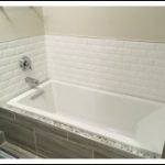
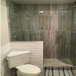 f elegant surprises. Straight on upon entering is the clean-featured shower, its frameless access door set in a huge clear glass panel. The enclosure’s walls and tub facing are clad in the same ceramic tile as the floor, and the quasi-brick tub enclosure is repeated as wainscoting on the opposite wall.
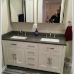
 A handsome vanity with matching sinks sits around the corner, in the now-vacated closet space, with shelves immediately opposite for linens and towels. The tub is a deep soaker model. And what about that corner toilet! It was simply twisted on its original stack to a diagonal angle — lever and efficient.
Not much was needed in the living room, bedroom, hall and
 entry. Tom did upgrade to 200 amp electrical service. He replaced carpet with engineered wood floors and reframed the three closets, swapping in standard-height sliders for the original floor-to-ceiling bi-fold doors. Windows now have solar shades — opaque in the bedroom. but a looser mesh in the living room.
 Tom an
 d his wife are busy professionals. But at the end of their hectic days they do indeed have a “warm but cool” place to come home to.
——
Bob Shamo is chair of the Newsletter Committee.
Questions addressed to news@ptcondo.com will be forwarded to the owner.
Have you rehabbed recently? Or made just one or two significant improvements to your home? Send us a pic and a short explanation. Units are identified by tier, and owners may remain anonymous if they prefer.

